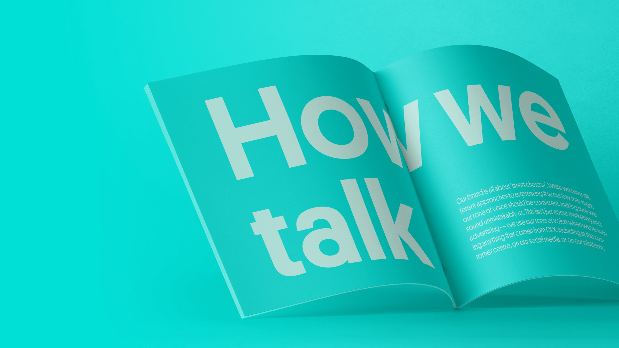
Illustration
To accompany our bold and bright visual language, we have a unique illustration style – built from the core elements of our brand.
These illustrations should be used sparingly, to support our messaging where needed.
To accompany our bold and bright visual language, we have a unique illustration style – built from the core elements of our brand.
These illustrations should be used sparingly, to support our messaging where needed.
Our illustrations are designed to be simple, clever and friendly. They’re based on the graphic shapes within our visual identity, and use our typical tonal colour treatment. Below is an overview of our library of illustrations.

Our illustration library can grow over time, depending on what we need to bring to life. We have a few key principles to keep in mind when creating brand illustrations.
We use the geometric shapes of our language as
the basis for all our illustrations. Using the O, L and
X to inform the main structure.
They are simple but have a level of detail that takes
them beyond icons. They will be used in spaces
where the visual storytelling is the hero, rather than
a functional, supporting asset.
Colour combinations and charcoal, cropped
corners, balance of round and square.
Try to use the OLX avatars instead of
realistic human features such as hands.
These illustrations will often be animated
with a simple motion so illustrations are
created with this in mind.
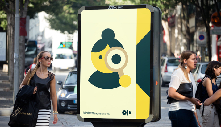
Our platform is broad, spanning many categories and speaking to many customers. It’s important our illustration style can flex to demonstrate many different things — from objects, to people, to functional processes or interactions.
Below is a simple step by step overview of how we create our illustrations.


We’re not creating icons, so we don’t have a super strict grid. Our illustrations need to have personality, but we do have a framework that applies to every illustration we create. In general, it should fit within a square. If the illustration is more random in its configuration, make sure the majority of it fits within a square, and only some of it extends into the outer square.
Fits in square

Extends into outer square

Our illustrations use the same approach to colour that we use throughout the rest of our brand — it’s confident, bold, and keeps things tonal — we don’t mix our colours all together. Below is a breakdown demonstrating how we use colour within our illustrations.


Here are some best practice examples of our illustrations in use.


Here are some things you should never do when creating or using OLX illustrations.
Do not use illustrations as a key feature of our brand — they should be used as supporting elements only.

Do not use every single one of our colours in one illustration. Stick to using the tonal approach to colour, shown above.

Do not include illustrations within typography.

Avatars should always resemble people, and not be too abstract or too playful.

Do not use multiple illustrations at different sizes or as backgrounds or patterns.