Art direction
We keep our photography bright and human, capturing our categories, users, and products in a refreshing way. No matter what our subject is, we make sure it’s empowering, confident and provocative.
We keep our photography bright and human, capturing our categories, users, and products in a refreshing way. No matter what our subject is, we make sure it’s empowering, confident and provocative.
We have three categories of art direction, to ensure we have flexibility to promote different aspects of our brand and our platform. Each category is defined by the specific focus of each image.
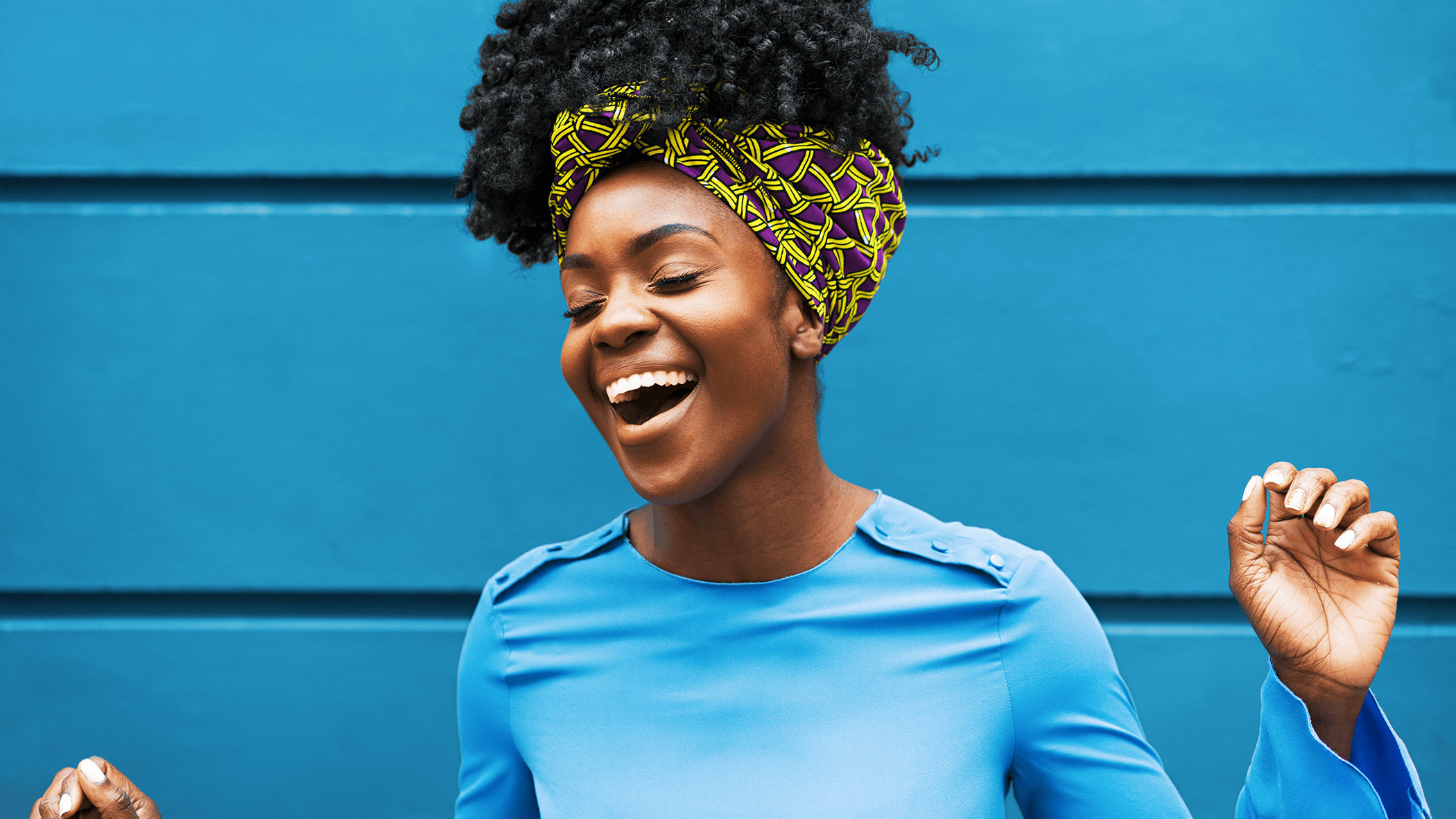
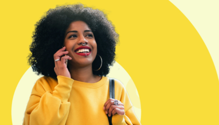
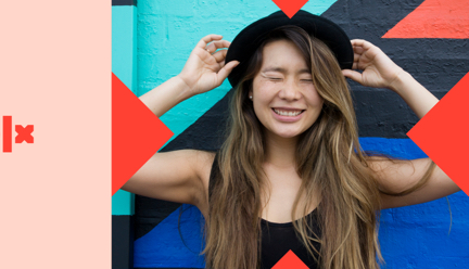
We can hero people in our photography to celebrate our users and the smart choices they make on OLX. The focus of these photographs should be a confident, charismatic expression, capturing the feeling of making a smart choice. These images should capture our customers in real moments in everyday enviroments.
When using our people-focussed photography in application, always make sure they’re the focus of the design. Use punchy headlines, but make sure not to cover their expression — these photos need to capture attention and engage with the audience.
We use lifestyle photography to give context to all the amazing things people can find on OLX, and the lives they can lead with our help. Our lifestyle images can feature our customers, but we focus on the environments and objects around them.
We can use our lifestyle photography in applications when we want to hero a particular category, or celebrate the opportunities that that our platform can unlock for our customers.
Our product photography is simple and impactful. We feature a range of different products you can find on OLX, and use them in a singular, bold way, cut out and placed on backgrounds of block colour and our graphics to make an impact.
Our product photography can be used when we want to simply show the great range of stuff you can find on OLX, highlighting the unexpected and exciting possibilities.
Here are some things you should never do with our photography.

Do not use imagery that clearly feels like stock photography, is over-posed, or “fake happy”.
Do not use photography with artificial light — everything should feel natural and everyday.
Do not use black and white imagery.

Do not use photography with rendered or photoshopped effects.
Do not use imagery that contains negative or inappropriate situations.
Do not use water-marked photography.

Don’t use images that are monotone, low in contrast or brightness.

Don’t ovelay graphics over photography.

Don’t use images with fake or staged backgrounds.
Don’t cut out images of people. We only apply this treatment to product based images.
Do not contain images within our graphic shapes.

Do not overlay patterns on our colour backgrounds.