Typography
To communicate our positive and playful message of empowering smart choices, we have a typeface that reflects our confident spirit. It’s bold and refreshing, yet functional – working in every size for both print and digital.
To communicate our positive and playful message of empowering smart choices, we have a typeface that reflects our confident spirit. It’s bold and refreshing, yet functional – working in every size for both print and digital.
Our typeface is Platform. Clear, confident yet playful, its geometric style reflects our logo and system, creating impact everywhere we use it. Our headline weight includes custom ‘O’ and ‘X’ characters to add playfulness and fun. Sometimes it will not be possible to use Platform for display or licensing reasons (such as in PowerPoint templates or emails). In this case, use our alternative font, Poppins.
Let’s test out Platform Headline! Have some fun typing out your message, changing the colour and playing with the scale. Remember to keep our headlines short - they shouldn’t be more than 10 words long.
To ensure that our customers can fully understand what we’re trying to say in every application, we have a framework for how we set type and organise the hierarchy of our messages.

Platform Headline
Headlines
Centered
Uppercase only
Leading: 100%
Tracking: 0

Platform Regular
Subheadlines
Sentence case
Leading: 120%
Tracking: 20

Platform Regular
Body copy
Sentence case
Leading: 120%
Tracking: 40

Platform Medium
Highlights or
calls to action
Where we position type in any particular application depends on the image we’re using. Our headlines should always be centred. We size headlines according to the X height of the logo, which is always centred to the headline, rather than the whole page width.
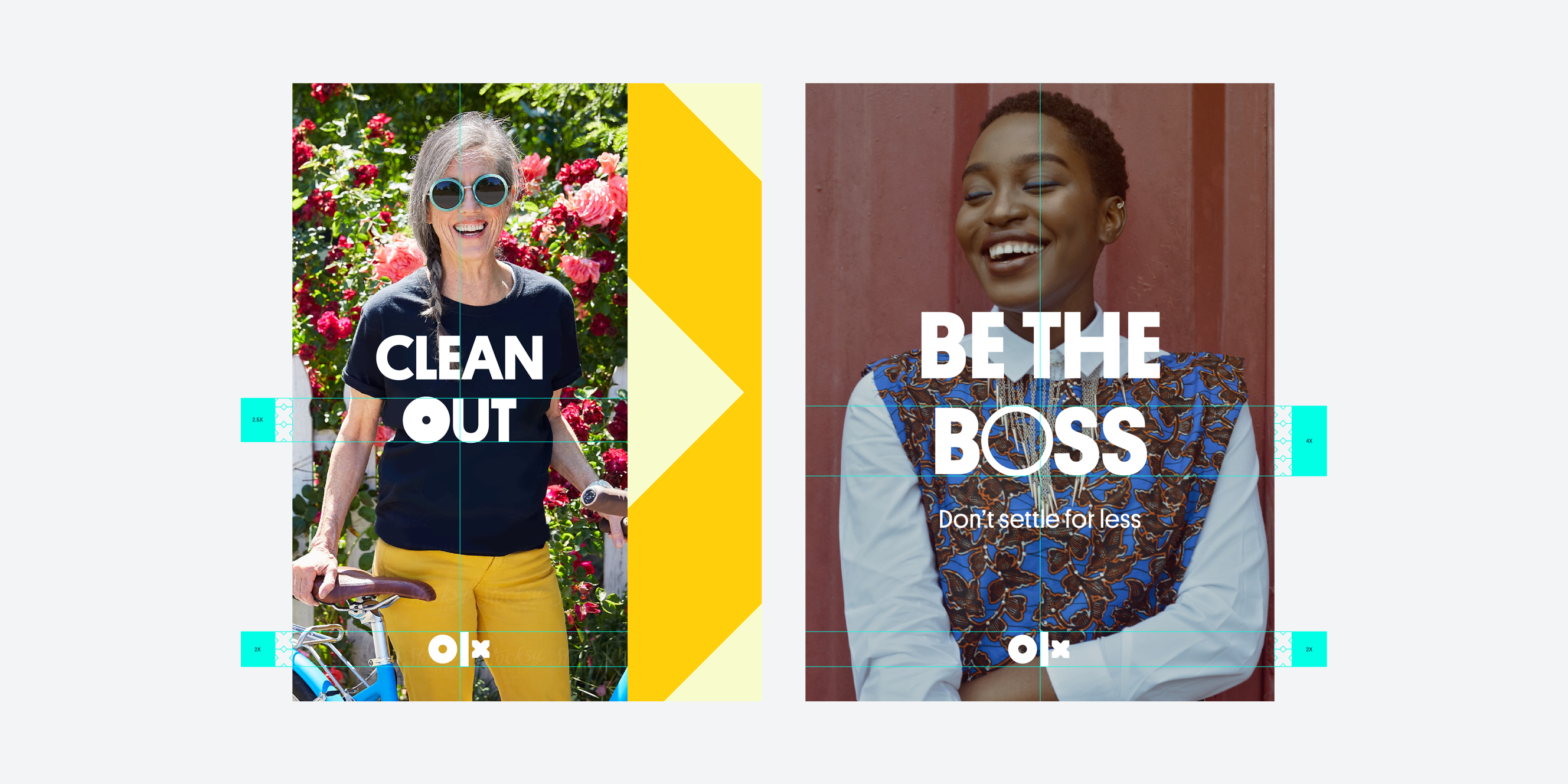
Here are some examples of things that break our typography rules.
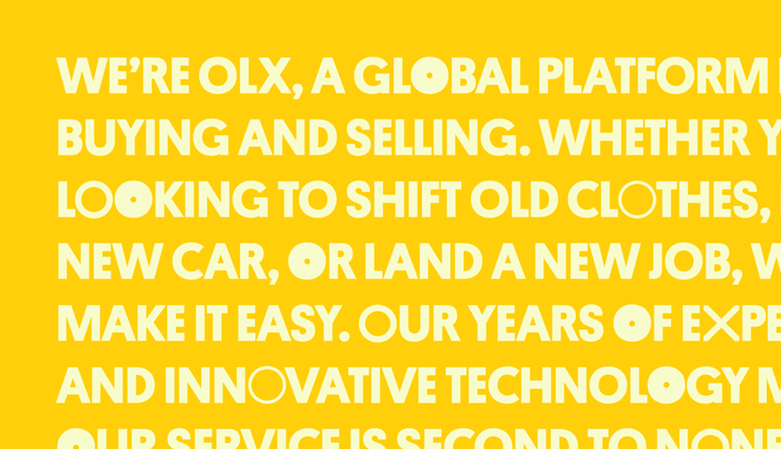
Do not use Platform Headline for body copy, or anything other than headlines.
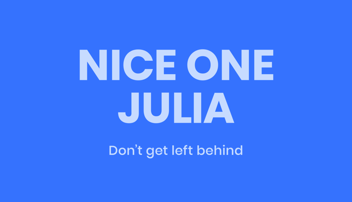
Do not use the alternative system font (Poppins) if Platform is able to be used.
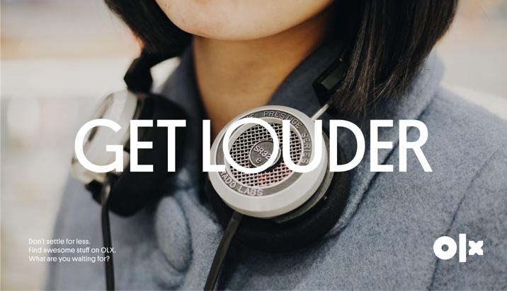
Do not use Platform Medium or Regular for headlines.
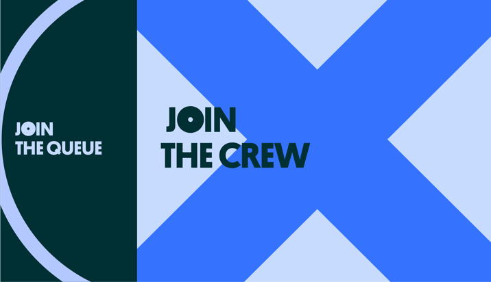
Do not left align headlines — they should always be centred to the area they sit within.
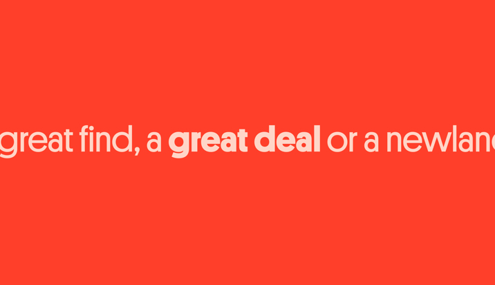
Do not use Platform Headline to highlight things or as calls to action — use Platform Medium instead.
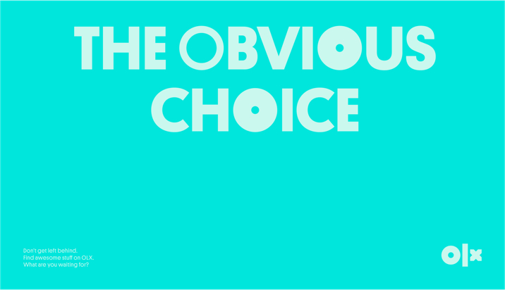
Do not align the headlines to the top of the layout. They should be vertically and horizontally centred.
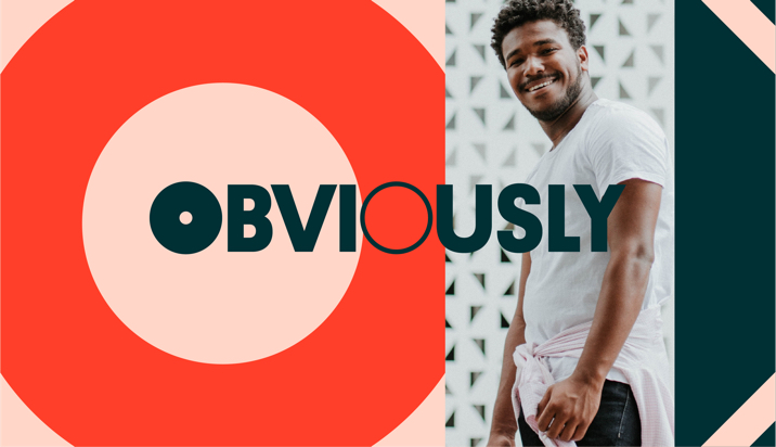
Do not centre headlines within the entire page width. Centre them to the graphic or photographic area.

Do not distort, rotate or stretch typography.
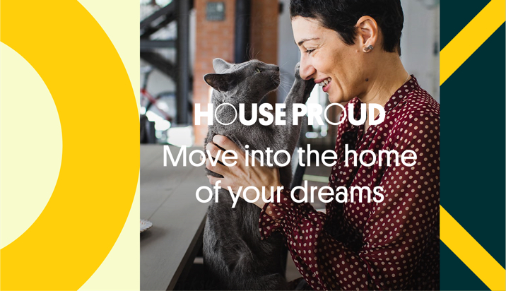
Do not lose typographic hierarchy in the layout.

Do not right or left align headline. Headlines should always be centred.

Do not use multiple type sizes within the same headline.
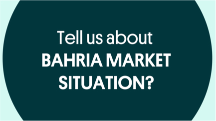
Do not mix typecases and weights within the same headline. Headlines should always be uppercase and using our Platform Headline typeface.

Our headlines shouldn’t have more than 10 words — keep headlines short and punchy. Extra information can be placed into subcopy.

Keep it simple — do not split the headlines into multiple lines.